The Map That Became a Flag: Why Kosovo and Cyprus Broke Vexillology's Most Sacred Rule
Julio Song · · 8 min read
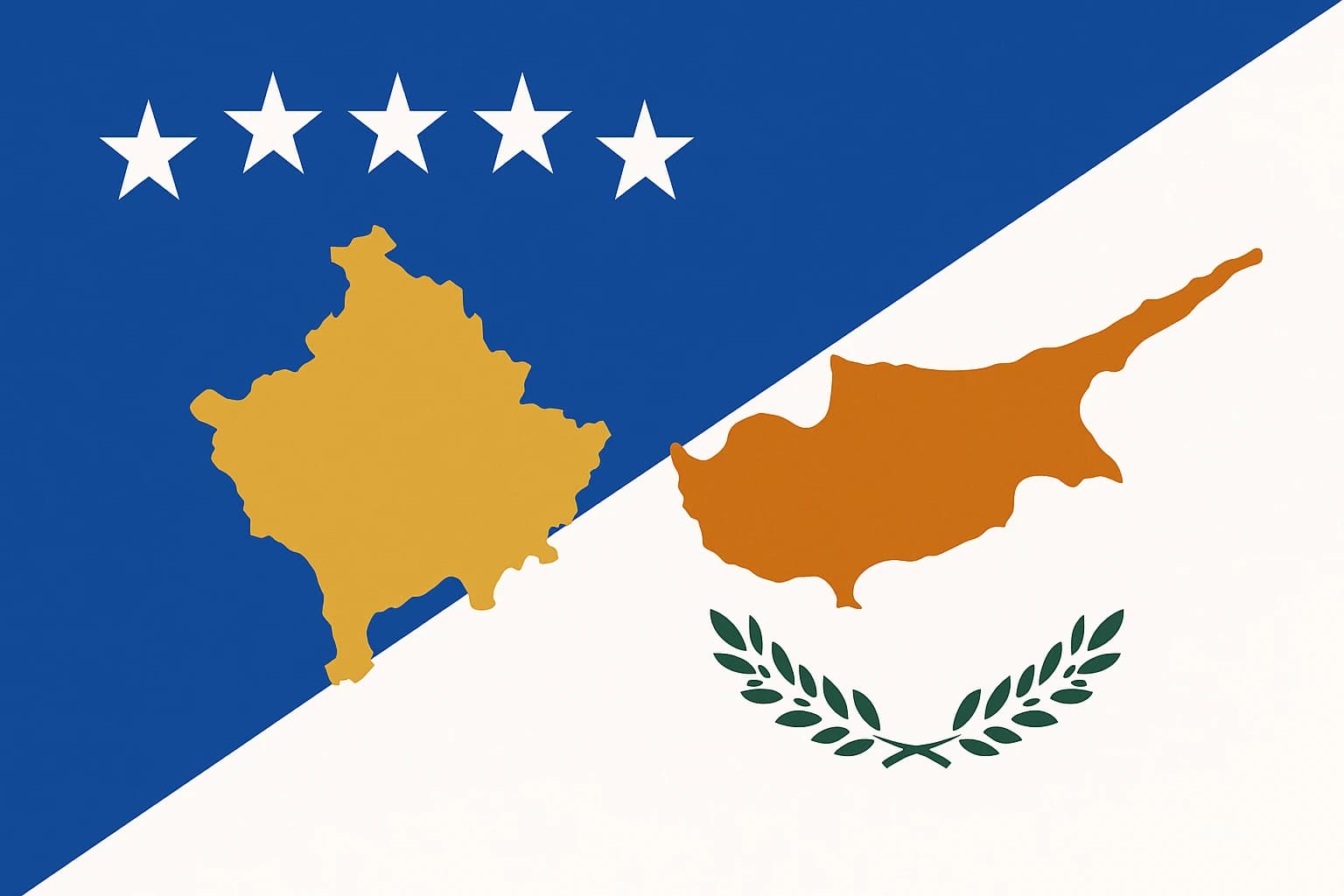
Picture a flag that works like a legal brief. A gold silhouette of a country's own territory, hovering above six white stars on a blue field. It looks clean enough. But ask any flag designer alive, and they'll tell you it's a catastrophic mistake.
That's Kosovo's flag. And it breaks what vexillologists consider the single most important rule in flag design: never put a map on a flag.
Kosovo did it on purpose, though. So did Cyprus. Two nations, one recognized and one partially, looked at the rulebook, understood the rule, and broke it anyway. The reason is simple enough: when a country's right to exist is actively disputed, a flag stops being decoration and becomes a territorial claim, a piece of fabric saying "we are here, and this is ours."
Why vexillologists hate maps
The North American Vexillological Association (NAVA) publishes five principles of good flag design. They're straightforward:
- Keep it simple (a child should draw it from memory)
- Use meaningful symbolism
- Stick to two or three basic colors
- No lettering or seals
- Be distinctive
A map on a flag violates nearly all of these. Maps are geometrically complex. They're impossible to recognize at a distance or when the fabric hangs limp in still air. They're inherently political, because every border line raises questions: whose borders? Drawn when? Recognized by whom?
And maps age badly. If borders shift, the flag becomes historically incorrect, or worse, provocative.
Consider Belize, whose flag features an elaborate coat of arms so detailed it resembles a painting more than a flag. It's a near-cousin of the maps problem, and vexillology circles treat it accordingly.
Now compare that to Japan's flag. A red circle on white. You see it from a mile away. You draw it in two seconds. It communicates without explaining.
Or Canada's maple leaf, clean and legible at any distance.
For contested states, the map problem gets worse. The outline you draw is itself a political statement. It implies sovereignty over every square kilometer of that shape. Neighbors and rivals notice. They object. Sometimes violently.
The "no maps" rule isn't aesthetic snobbery. It comes out of centuries of practical experience about what flags are for: being recognized quickly, from a distance, for a long time. Which makes Kosovo's and Cyprus's choices worth explaining.
Cyprus: the map with a wound running through it
Cyprus adopted its flag at independence in 1960. A copper-orange silhouette of the entire island sits above two crossed olive branches on a white field. The color represents the island's copper deposits (Cyprus literally means "copper" in ancient Greek). The olive branches signal peace between its Greek and Turkish communities.
Notice the word "entire." The flag depicts the whole island. Cyprus has been effectively partitioned since the Turkish military intervention of 1974. The northern third operates as the Turkish Republic of Northern Cyprus (TRNC), recognized only by Turkey. A UN-monitored buffer zone, the Green Line, bisects the island. Greek Cypriots live in the south. Turkish Cypriots live in the north. Two separate governments, two separate economies, two separate phone systems.
Yet the flag still shows an undivided island.
In 1960, the design was a compromise. British colonial rule was ending, and the new republic needed a flag that avoided the symbols of either the Greek Cypriot majority (who favored enosis, union with Greece) or the Turkish Cypriot minority. The map was chosen because it was "neutral": geography rather than ethnicity.
After 1974, that neutral map became one of the most politically loaded images in international heraldry. Every time it flies at the UN, at EU summits, at embassies around the world, it implicitly asserts that the north is occupied Cypriot territory. The map describes nothing. It demands something.
As of 2026, reunification talks have stalled repeatedly, including the collapse at Crans-Montana in 2017 and subsequent rounds that produced little progress. The map on the flag grows more aspirational, and more politically charged, with each passing decade.
Kosovo: born disputed, flag included
Kosovo's flag was designed and adopted within days of the declaration of independence on February 17, 2008, for a country that had not legally existed the week before.
The design is a dark blue field (echoing the EU flag, and deliberately so), a gold map-silhouette of Kosovo's territory, and six white stars for its six major ethnic communities: Albanians, Serbs, Bosniaks, Roma, Turks, and Gorani.
The designer faced an impossible brief. Kosovo couldn't use Albanian national symbols. The double-headed eagle on Albania's flag would have inflamed Serbian and international concerns about a "Greater Albania" agenda.
Kosovo needed something civic and multiethnic, and the map was the only thing every community shared: not an ethnic symbol or a religious one, but the land.
The map gains its weight from the numbers. As of mid-2026, roughly 101 of 193 UN member states recognize Kosovo. Serbia considers it a breakaway province. Russia and China back Serbia's position. Five EU members, Spain, Slovakia, Romania, Greece, and Cyprus itself, withhold recognition. Kosovo is not a UN member.
Its flag depicts a territory whose borders are legally contested by some of the world's most influential governments. Most flags show you what a country stands for. Kosovo's flag shows you where Kosovo is, because "where" is the thing in dispute.
The designer's impossible brief
The Kosovar Assembly held an open design competition and received hundreds of submissions, many featuring the Albanian eagle. Those were rejected for the reasons above. The winning design, by Muhamer Ibrahimi, had to look like a nation's flag without provoking any of the parties who might block that nation's existence.
The EU's involvement in Kosovo's independence, through the EULEX mission and the Ahtisaari Plan, shows up in the flag's visual language. That blue field and gold coloring are unmistakably EU-coded. It was a deliberate signal: Kosovo saw its future in European integration, not pan-Albanian nationalism.
Other new states went a different way. South Sudan, independent in 2011, chose Pan-African symbolism and a single gold star.
Timor-Leste, independent in 2002, used bold graphic elements. No map in sight.
Why did Kosovo reach for a map when others didn't? The answer lies in legal vulnerability. South Sudan had a referendum and UN backing before independence. Timor-Leste had a UN-administered transition. Kosovo declared independence unilaterally. The map is the flag's way of saying: "this specific territory, with these specific borders, this is what we are claiming, and there is no ambiguity."
The flag also has a second audience beyond Kosovars: diplomats, the International Court of Justice (which issued a non-binding advisory opinion on Kosovo's independence in 2010), and UN bodies reviewing Kosovo's status. This is heraldry as legal argument.
Cartographic nationalism
When a state puts a map on its flag, it is usually anxious about its own borders. The impulse to show your territory explicitly comes up when that territory is challenged.
Scholars call this cartographic nationalism. Benedict Anderson, in "Imagined Communities," wrote about how maps shape national identity. J.B. Harley argued that maps are never politically neutral, that they are arguments about who owns space. A map on a flag is that argument flown from every government building.
Contrast this with the flags of long-established, territorially secure nations: the UK's Union Jack, France's tricolor, the US Stars and Stripes.
None of these show maps. Those countries' borders are not in serious dispute, so they can afford abstract symbols. Kosovo and Cyprus cannot.
There's a paradox in it. By putting the map on the flag, both countries reveal their insecurity and try to fix it in the same gesture.
It's worth wondering what future contested states would do. If Scotland, Catalonia, or Taiwan shifted their political status, would they reach for a map? Taiwan's flag shows no map at all, even though the Republic of China's claim historically extended to the mainland, a legacy that still echoes in its official symbols.
The rule, the exception, and what comes next
NAVA and the Flag Institute rate Kosovo's and Cyprus's flags poorly on aesthetic and functional grounds. They're hard to reproduce, hard to recognize at a distance, and they carry the built-in risk of ageing badly.
The counterargument is that the "no maps" rule describes what works for established nations, not for nations fighting to be recognized as nations at all. For Kosovo and Cyprus, breaking the rule was the rational choice.
What happens if the situation changes is a harder question. If Kosovo achieves full UN membership, does the map become redundant, a reminder of old insecurities rather than a statement of current resolve? If Cyprus is reunified, does the undivided island silhouette simply become accurate, or does the flag get redesigned? Flags, unlike borders, are difficult to change once adopted, because people grow attached.
With Kosovo's EU accession talks advancing slowly in 2026 and recognition still incomplete, the flag's map is still a live political document rather than a historical artifact.
There's a real tension in that. The "no maps" rule assumes flags are timeless, and these two are by design temporary arguments, made for the moment of contestation. Whether that makes them brave or brittle depends on whether the argument is eventually won.
Most countries have had centuries to encode their politics in eagles and stars and crescents that time has softened into familiarity. Kosovo and Cyprus have no such comfort. Their flags are still arguing.
Julio Song
Writer
Julio is a staff writer at FlagDB. He studied Mathematics at the University of Madrid and has a passion for vexillology.
More from Julio Song →Related articles
The Map That Became a Flag: Why Cyprus and Kosovo Put Their Own Borders on Their Banners, and What That Desperate Move Reveals
Maps on Flags: Why Cyprus, Kosovo, and Christmas Island Put Their Geography Front and Center