The Diagonal That Refuses to Be Ignored: What Trinidad, Tanzania, and Namibia's Bold Stripes Are Really Saying
Julio Song · · 8 min read
Line up the world's nearly 200 national flags and the structural sameness jumps out. Horizontal bands stacked like sediment. Vertical tricolours standing at attention. Solid fields with an emblem in the middle. Against that background the diagonal stripe is rare, and it carries a charge the other layouts do not.
The diagonal is never a neutral choice. Horizontal bands connote stability and order; vertical stripes suggest formality and sovereignty. A diagonal cuts across the field like an event, implying motion, collision, or something being stitched together. Three flags from three continents, three independence stories, and three different uses of the same geometry make the case: Tanzania, Namibia, and Trinidad and Tobago.
Why shape is never neutral
Vexillologists distinguish between divisions, meaning how the field is split, and charges, meaning the symbols placed on top. Most popular writing about flags is about charges: the eagle, the crescent, the stars. Divisions get far less attention.
Horizontal bands dominate global flag design, and the roots are heraldic. The horizontal partition, "barry" in heraldic terms, reads as stable, grounded, and sequential, earth beneath sky. Germany's black, red, and gold is the obvious example, as is the vast majority of African tricolours adopted after 1960.
The diagonal, "per bend" or "per bend sinister" in the same vocabulary, is structurally transgressive. It puts implied movement and asymmetry into what is otherwise a static rectangle, so the eye gets pulled across the flag instead of settling on it.
It is also scarce. Of the 193 UN member state flags, only a handful use a true diagonal as the primary structural division, and that count excludes layered designs like the Union Jack, which contains diagonal elements without being organized around them. The scarcity is what makes each example worth reading closely. What is a nation saying with a diagonal that it could not say with a band?
Tanzania's black seam
Tanzania was born on April 26, 1964, from the merger of two countries: Tanganyika, independent since December 1961 under Julius Nyerere, and the People's Republic of Zanzibar, which had gone through its own revolution that January. Two nations, two identities, two coastlines, and no guarantee the join would hold.
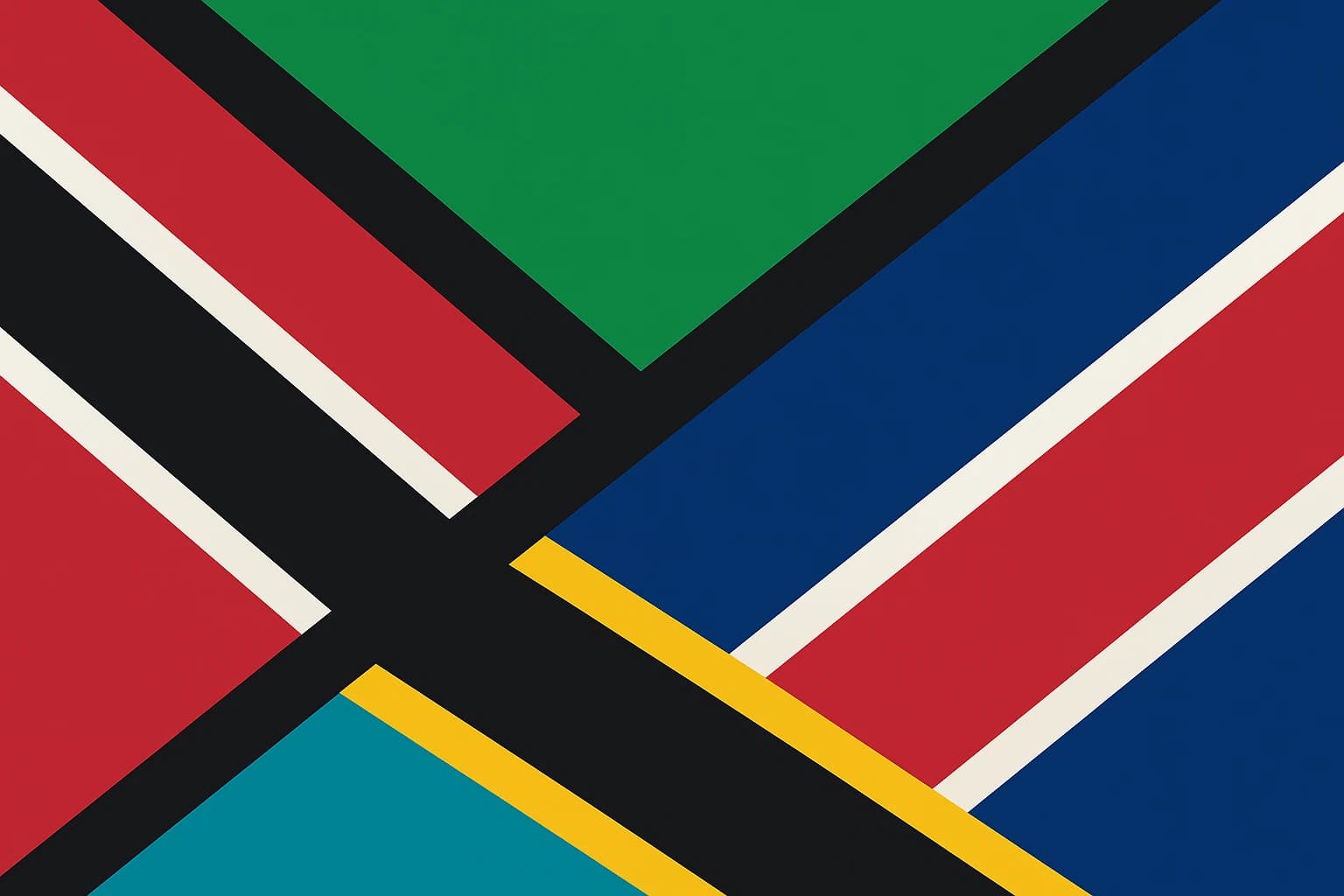
The architecture tells that story. A black diagonal runs from the lower hoist to the upper fly, bordered on each side by a narrow gold stripe, dividing the flag into a green triangle at the upper hoist and a blue one at the lower fly. The colours are legible enough: green for the mainland's land and agriculture, blue for the Indian Ocean and Zanzibar's waters, gold for mineral wealth, black for the Swahili people.
The black stripe is not decoration. It is a seam, the line where two nations were sewn together, and no other division could carry that. A horizontal band would put one country above the other. A vertical band would set them side by side but separate. The diagonal makes both halves equal and interpenetrating. The design also drew on both predecessor flags, blending Tanganyika's TANU party colours with Zanzibar's revolutionary palette.
The tension it was built to manage has not gone away. Tanzania's union remains constitutionally complex, and Zanzibar still has its own president and parliament, which means the seam is arguably still holding together something that never fully fused.
Namibia's red slash and borrowed sky
Namibia became independent on March 21, 1990, after a 23-year armed liberation struggle by SWAPO, the South West Africa People's Organisation, against South African administration, itself preceded by decades of German colonial rule. The flag was designed as part of the independence settlement negotiations.
A red diagonal bordered by narrow white stripes runs from the lower hoist to the upper fly, on the same axis as Tanzania's. The upper triangle is blue, the lower is green, and a golden sun sits in the upper hoist.
The red is not ambiguous. It references SWAPO's flag and the blood of the liberation struggle, as the official government proclamation stated. The liberation movement is drawn straight across the new nation's face.
Then there is the blue. Namibia's particular shade in the upper triangle is widely noted by vexillologists as an echo of Botswana's flag, which Namibia's independence leaders had long admired as a model of peaceful, non-racial governance.
That is a diplomatic signal embedded in a colour choice, and the diagonal frames it, presenting the blue as the field the new state was aiming at.
Where Tanzania's seam looks backward at an act of union, Namibia's diagonal reads as motion: the red of struggle giving way to the blue of what came after. The geometry stages a before and an after.
Trinidad and Tobago: a charter written in geometry
Trinidad and Tobago became independent from Britain on August 31, 1962. The flag was designed by Carlisle Chang, a celebrated Trinidadian artist, and its symbolism was formally documented in the independence proclamation, which is an unusually explicit act of meaning-making.
A black diagonal bordered by narrow white stripes runs from the upper hoist to the lower fly, the opposite direction from Tanzania and Namibia, across a deep red field. No emblem, no additional geometry. Just the stripe, austere and sure of itself.
The documented meanings: red for the warmth of the sun and the vitality and courage of the people, black for the dedication of a people joined by one strong bond, white for the sea that unites the two islands and the equality of all under the sun. Very few governments have published what each colour means at the moment of adoption, and it makes this flag unusually easy to read on its own terms.
Chang was not a government functionary but a modernist painter deeply engaged with Caribbean identity, and the flag's minimalism, with no coat of arms and no colonial legacy symbols, was itself an argument about what postcolonial identity should look like.
Does it matter which way the stripe runs?
In heraldry, "per bend" runs from upper-left to lower-right, Trinidad and Tobago's direction, while "per bend sinister" runs from lower-left to upper-right, as in Tanzania and Namibia. In European tradition the sinister bend carried negative connotations, associated with bastardy and dishonour.
That baggage almost certainly did not reach the designers in Dar es Salaam or Windhoek, which is rather the point. Postcolonial flag design operates outside inherited European heraldic grammar, reinventing the diagonal's meaning rather than receiving it.
Direction still affects how a flag reads, in a way that has nothing to do with culture. Work in visual psychology suggests that lines running from lower-left to upper-right are perceived as ascending by most viewers, while lines running upper-left to lower-right read as descending. That gives the Tanzanian and Namibian diagonals an unconscious upward quality.
Trinidad and Tobago's downward diagonal reads instead as grounding, a black band anchoring an energetic red field, which lines up neatly with Chang's documented intent about the bond that joins the people. Whether or not the designers thought in these terms, the effect sits in the geometry, which is why looking at divisions turns up things that colour analysis alone misses.
Other flags that break the grid
The diagonal turns up in a few other places, and it consistently marks a break from the norm.
The Republic of the Congo puts a diagonal yellow stripe between red and green fields.
Brunei uses a diagonal division to structure its design.
South Africa's flag, adopted in 1994, deserves its own note. The Y-shaped pall contains two diagonal elements converging at the centre, and the designer, Frederick Brownell, described them as lines of convergence rather than division. A third use of the geometry, beyond seam and slash.
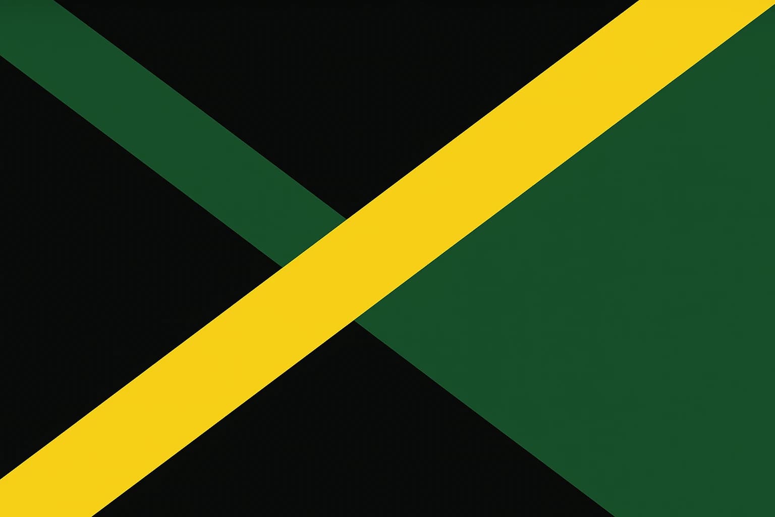
Jamaica, independent in 1962, the same year as Trinidad and Tobago, took the idea to its extreme with a diagonal cross, or saltire, dividing the flag into four triangles of gold on black and green. The geometry is inseparable from the impact.
The regional pattern is hard to miss. A disproportionate number of diagonal flags come from postcolonial nations in Africa and the Caribbean, the places most actively building new national identities from scratch in the mid to late twentieth century.
The case that tests the pattern is Czechia. The diagonal white triangle pointing from the hoist into the field was added in 1920 to distinguish Czechoslovakia from the nearly identical flags of Poland and Russia, so the geometry is doing purely differentiating work. Even there, though, it marks a break from something: in this case from resembling the neighbours.
Suture, rupture, declaration
The three main cases resolve into a rough taxonomy. Tanzania's diagonal is a suture, the seam joining two things that were separate. Namibia's is a rupture, dividing a colonial past from what followed. Trinidad and Tobago's is a declaration, a self-authored statement of identity. Test the categories against the Republic of the Congo, South Africa, or Jamaica and they hold up reasonably well.
The obvious objection is that these meanings are retrospective, that designers picked diagonals for aesthetic reasons and the significance arrived afterward. Trinidad and Tobago answers that directly, since Chang's meanings were documented at independence rather than retrofitted. And where intent really is ambiguous, the geometry still produces the effect on the viewer, which is what determines how a flag works in the world.
The question is live again. Several nations are debating redesigns, New Zealand's referendum conversation keeps resurfacing, and various postcolonial states are discussing the removal of colonial symbols. Any of them will have to decide what geometry to use, and the diagonal is sitting there for whichever one needs to say that something has changed.
Julio Song
Writer
Julio is a staff writer at FlagDB. He studied Mathematics at the University of Madrid and has a passion for vexillology.
More from Julio Song →Related articles
Diagonal Lines and Divided Futures: How Guyana, Tanzania, and Saint Kitts and Nevis Used Slashes to Tell Stories of Struggle
The Diagonal That Changed Everything: How Saint Kitts and Nevis Turned a Simple Black Stripe Into a Masterclass in Flag Geometry