Greenland is the world's largest island, 836,330 square miles of ice, rock, and tundra, and for most of its modern history it has been politically invisible: a Danish postscript tucked into the upper-left corner of the map where nobody looks twice.
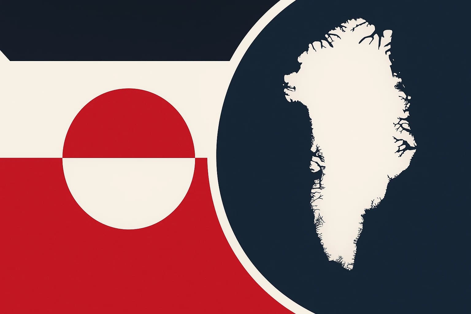
Then, on June 21, 1985, the Greenlandic Home Rule government unveiled the Erfalasorput, which translates as "Our Flag." It looked like nothing else in the Arctic. No Scandinavian cross, no diagonal bar, no echo of Copenhagen or Oslo or Reykjavík. Instead, a white-and-red circle bisected by the horizon line, half red above, half white below, or the reverse depending on which half you read first.
That was a political act wearing the disguise of graphic design. With Greenlandic independence now sitting near the center of Arctic geopolitics, it is worth understanding what the flag was saying. The Erfalasorput has been saying "independence" for over 40 years, and the politics are only now catching up.
The Nordic cross monopoly
To understand what Greenland rejected, you need to understand what it was supposed to accept.
The Scandinavian cross, that off-center cross shifted toward the hoist side, traces its origin to the Dannebrog, Denmark's flag. Legend holds that it fell from the sky during a battle in 1219. More reliable records date its use to around 1370, making it the oldest continuously used national flag on Earth.
It spread, and not by accident. The cross became the visual grammar of the entire Nordic world through deliberate cultural propagation. If you were Scandinavian, or Scandinavian-adjacent, or Scandinavian-aspirational, you put a cross on your flag.
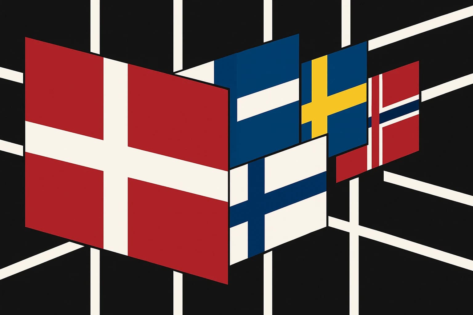
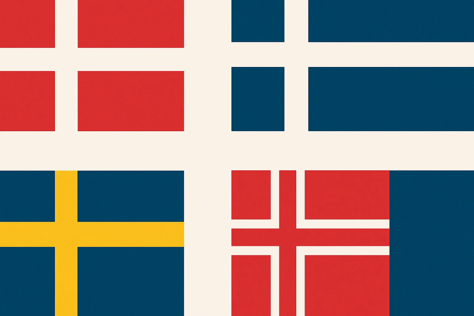
The conformity is remarkable. Iceland adopted its cross design in 1915, nearly three decades before full independence in 1944. Finland, Norway, and Sweden all bear the cross, all using the same offset-left layout.
Even non-sovereign Nordic territories defaulted to the same language. The Åland Islands, administered by Finland but culturally Swedish, adopted a Swedish-cross-influenced design. When discussions began in the 1980s about a Sámi flag, early proposals wrestled with whether to include cross elements before the designers settled on a drum-circle motif in 1986.
The cross was never purely aesthetic. It was a membership badge, a signal of belonging to a civilizational club built on Lutheran heritage, Scandinavian governance models, and a particular brand of northern European statehood. If your flag had the cross, you were in the family.
By 1979, when Greenland achieved Home Rule, the question was sharp. Did Greenland want to belong to that family visually, or was the Nordic cross a colonial inheritance dressed up as tradition?
Designing against empire
The Home Rule government ran a design competition in the early 1980s. Submissions poured in, many of them with cross elements, many of them safe. The winning design came from Thue Christiansen, a Greenlandic politician and artist. The authorship mattered: a Greenlander designed Greenland's flag, and the process itself was a political statement.
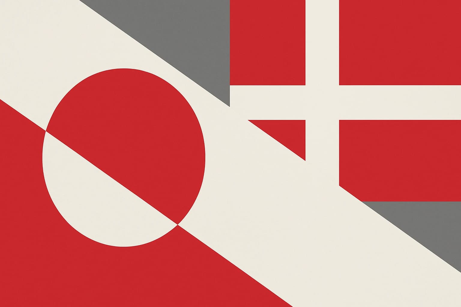
The symbolism Christiansen encoded was clever. The red-and-white semicircle represents the sun setting, or rising, over the ice cap. It also uses the specific red and white of the Dannebrog, Denmark's own colors. That was a deliberate dual reading, acknowledging Danish heritage while visually subordinating it to a Greenlandic context. The Danish palette is present, but rearranged.
The inversion is the point. Denmark's flag is red with a white cross. Greenland's is a white field with a red-and-white circle. Same ingredients, completely different meal, and a legible piece of visual back-talk to the colonial parent.
The adoption date was no accident either: June 21, 1985, Greenland's National Day, Ulloriarsuaq, and the summer solstice, when the sun barely sets above the Arctic Circle. A flag about sunlight, adopted on the longest day of the year.
What was rejected matters as much as what was chosen. Several submitted designs incorporated cross elements or Nordic visual language, and the Home Rule government's selection of Christiansen's design was a conscious vote against them.
The Faroe Islands: what happens when a dependency keeps the cross
The most instructive counterexample sits in the North Atlantic, roughly halfway between Iceland and Norway. The Faroe Islands adopted their flag, the Merkið, informally in 1940 during World War II. British forces had occupied the islands, Danish authority was severed, and the Faroese needed a flag that was not the Dannebrog. So they designed one.
The Merkið has a red cross with a blue border on a white field. It is deliberately distinct from the Dannebrog but unmistakably within the Nordic cross family. The blue-and-red combination nods toward Norway's flag, acknowledging the deep historical and linguistic ties between the Faroese and Norwegian peoples. It was a wartime assertion of identity that stayed inside the visual system.
The comparison sharpens from there. The Faroe Islands, like Greenland, have significant autonomy from Denmark, and the Faroese independence movement is alive. A 1946 referendum showed a narrow majority for independence, though the result was later annulled by the Danish king, and the conversation continues in 2026.
But the two flags say fundamentally different things. The Merkið says: we are Nordic people asserting our particular Nordic identity. The Erfalasorput says: we are a different kind of people entirely, and our flag is not in conversation with Nordic convention at all. One is reform within the system, the other is departure from it, and each has tracked the tempo of its territory's independence conversation with some accuracy.
Flag design as political vocabulary
The tension between visual conformity and visual independence is not unique to the North Atlantic. Dependent territories everywhere use flag design as a proxy for political aspiration.
The Cook Islands retain the Union Jack in the canton but add 15 stars for their own islands, a hedged identity with a foot in each world.
New Caledonia goes further: the pro-independence Kanak flag flies alongside the French tricolor in an official two-flag system. Two flags, one territory, two possible futures.
Svalbard is the Arctic's own counter-case. It has no flag of its own at all and flies the Norwegian flag, because the 1920 Svalbard Treaty gives Norway sovereignty without granting the territory autonomous governance. The absence of a flag is itself a statement. No self-governance, no symbol of self-governance.
The Pitcairn Islands sit at the Pacific extreme. Their flag keeps the British Blue Ensign template but adds a Pitcairn badge with the Bounty's anchor and Bible. It is a tiny community, too small to mount a meaningful independence movement, and its flag grammar stays firmly colonial.
Vexillology has a useful term for this: flag grammar, the idea that design choices, colors, layouts, and the presence or absence of inherited imperial elements signal geopolitical allegiances as legibly as written words. Sophisticated political actors understand this and choose accordingly. Greenland's designers understood it better than most. They were not making a pretty flag, they were making a foreign policy document.
The flag that predicted the future
Bring the clock forward to 2026. Greenland's independence conversation has intensified. The Inatsisartut, Greenland's parliament, has passed resolutions affirming the goal of full sovereignty. Renewed U.S. geopolitical interest in the island's strategic Arctic position, its rare earth minerals, and its location straddling North American and European spheres has made Greenland's status one of the most watched territorial questions anywhere.
The 1985 flag amounted to a 40-year head start. By establishing a distinct visual identity before full independence, Greenland avoided the awkward post-independence scramble to design a flag for a new nation. Many decolonized African and Asian nations in the 1960s had to invent their symbols overnight, under pressure, with new governments and new borders to project all at once. Greenland will not have that problem.
The irony is that the Erfalasorput's semicircle design, radical in 1985, is now recognized internationally enough that it would translate seamlessly into the flag of an independent republic. No redesign required. Its willingness to break from convention is what future-proofed it.
Inside Greenland, the flag's reception has followed a telling arc: initial controversy, with some Greenlanders finding it too abstract and too unlike a traditional flag, then gradual embrace, and now near-universal affection. That trajectory mirrors the growth of Greenlandic political confidence.
One detail deserves attention. The Erfalasorput incorporates no explicit Inuit cultural imagery. No kayak, no polar bear, no drum. Yet it is widely read as an Indigenous flag, not because of what it chose but because of what it rejected. By refusing the Nordic cross, it became legible as the flag of a non-Scandinavian people. The omission did the work.
What makes a flag radical?
Vexillological radicalism is not about complexity or how many colors and symbols you pack in. It is about how legible the break from inherited convention is. Greenland's flag achieves that with maximum economy: two colors, one circle, one horizon line.
Compare it with Japan's Hinomaru, a red circle on a white field, simple and ancient and unmistakable. Or with the Libyan flag of 1977 to 2011, a solid green rectangle with no other elements at all, adopted as a direct expression of Gaddafi's political ideology and arguably the most radical flag ever used by a recognized state.
The Erfalasorput's power comes partly from what it leaves out. No text, no coat of arms, no complex emblems, no Nordic cross. Every omission is doing political work.
Was this radicalism fully understood in 1985? Probably not. Political design often works that way, its meaning deepening as history catches up. In 1985 it was a bold design choice. In 2026 it reads as prophecy. If Greenland achieves full independence, the Erfalasorput will have been a sovereign flag in all but legal name for over 40 years, which makes it one of the longest-running experiments in pre-emptive national identity design in modern history.
A flag that was always ready
Picture the Erfalasorput flying against an Arctic sky, white and red against endless blue. It does not look like a flag that needs a nation. It looks like a flag that has been waiting patiently for one.
Greenland's 1985 design was a quiet act of symbolic self-determination that preceded, and arguably enabled, the political self-determination conversation now unfolding. Look at the Nordic cross flags surrounding it, Iceland and the Faroes and Denmark itself, and Greenland sits outside that visual family not as an outcast but as a deliberate defector.
Sometimes the most consequential political documents are not treaties or constitutions but the things a people choose to put on a flag, and what they choose to leave off.