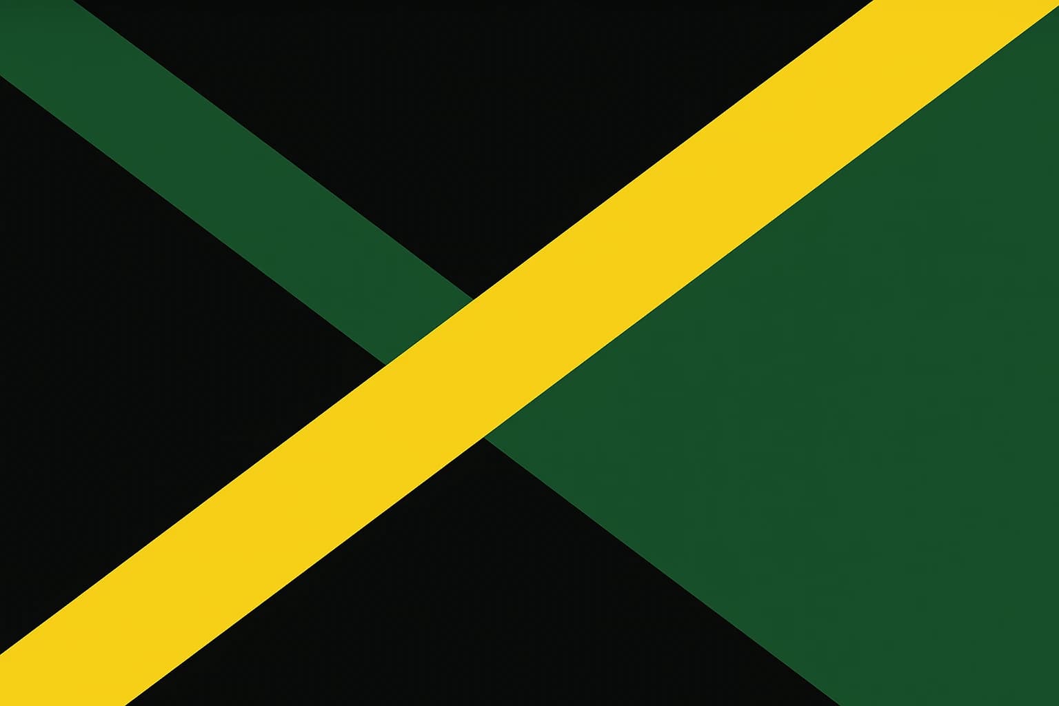
Black Is Not Nothing: The Radical Political Statement Hidden in Jamaica's Flag
Julio Song · · 9 min read
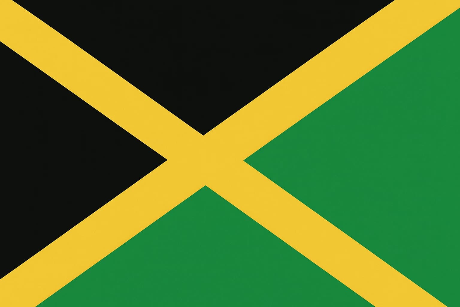
Of the 193 UN-recognized national flags flying in 2026, Jamaica's is the only one that contains neither red, white, nor blue. Those three colors dominate the visual language of nations, from the Union Jack to the Stars and Stripes to the French Tricolore. They show up in the flags of former colonies, revolutionary republics, and constitutional monarchies alike. And then there is Jamaica, alone with black, gold, and green.
When the Jamaican flag was raised for the first time on August 6, 1962, it wasn't carrying a pleasant color scheme chosen for aesthetics. It was carrying an argument: that independence means building a new visual vocabulary rather than borrowing from the old one. Every color on it is a claim, and every color left off is a rejection.
The color language of colonialism, and why rejecting it mattered
Look at the flags of the major Western colonial powers. The United Kingdom, France, the Netherlands, the United States. Red, white, and blue, in various arrangements, over and over again.
This isn't a coincidence. Those colors became a kind of soft-power shorthand, a visual grammar that signaled belonging to a particular world order. When newly independent nations designed their flags in the mid-twentieth century, many reached for the same colors, whether consciously or not. The result was a sort of vexillological deference, where the flags of former colonies ended up looking like they belonged in the same visual family as the flags of their former rulers.
The Caribbean is full of examples. Trinidad and Tobago's flag uses red, white, and black. Barbados features ultramarine blue and gold. Saint Lucia leans on blue, black, white, and yellow. Even where the specific meanings differ, the palette often echoes the colonial era.
Jamaica's designers, working in the charged political climate of 1962, broke from that pattern deliberately. The Non-Aligned Movement was gaining momentum. Pan-Africanism was reshaping identity politics across the Caribbean and the African continent. The question wasn't only about political sovereignty. It was about visual sovereignty, about what independence should look like when you held it up on a pole for the world to see.
The design battle: what Jamaica almost looked like
The flag we recognize today was not the first design on the table. The original proposal was a horizontal green-black-gold tricolor with simple stripes. It was rejected, in part because it looked too much like the flag of Tanganyika, modern-day Tanzania, which had gained independence in 1961.
That rejection set off a revision process led by a bipartisan committee of the Jamaican parliament. The committee landed on the diagonal cross, known as the saltire, and the choice carried its own meaning. Horizontal stripes were the convention for newly independent African and Caribbean nations. The saltire broke from that convention and made Jamaica's flag immediately distinguishable.
Two dominant political figures oversaw the process: Norman Washington Manley of the People's National Party and Alexander Bustamante of the Jamaica Labour Party. These were rivals in nearly every other sphere of Jamaican politics, and on the flag they found rare consensus. It had to be bold, original, and beholden to nobody.
One detail is worth pausing on. The saltire comes from heraldic tradition, but Jamaica's version contained no Union Jack. Many Commonwealth nations at the time kept the British flag in their canton, the upper-left corner. Australia and New Zealand still do.
Jamaica left that corner empty, or more precisely filled it with gold and green. The absence of the Union Jack was the point rather than an oversight. So was the fact that the flag was debated and finalized in the Jamaican parliament rather than outsourced to a British design firm.
Black as statement, not absence
In European color symbolism, black is almost always tied to mourning, death, or negation. When Europeans see black on a flag, they tend to read it as somber, as a warning, as an ending. That reading is a cultural bias, and Jamaica's flag challenges it directly.
In the Pan-African color tradition, black represents the people of African descent. It is an affirmation rather than an absence.
The roots of that tradition run straight to another Jamaican: Marcus Garvey. His Universal Negro Improvement Association adopted a red, black, and green flag in 1920, with black at its center as a declaration of racial pride and solidarity.
Jamaica's national flag draws on Garvey's framework. The designers replaced red with gold but kept black at the heart of the design, in the widest bands of the saltire cross.
The flag's original motto spells it out: "Hardships there are, but the land is green and the sun shineth." Black is linked to the hardships, to the legacy of slavery and colonialism. But notice the framing. Black isn't hidden or softened. It is worn openly, acknowledged as part of the national story rather than buried under prettier colors. Some newly independent African nations in the 1960s faced diplomatic pressure to tone down Pan-African color choices, to make their flags more palatable to Western partners. Jamaica refused to play that game.
The Jamaican-born cultural theorist Stuart Hall, whose work on diasporic identity became influential in later decades, wrote about identity as a "production" involving both continuity and rupture. The flag's black works that way. It looks backward at the history of enslavement and colonialism, and it also looks forward, claiming blackness as a foundation for national identity rather than a scar to cover up. Grief and pride sit in the same color on the same flag without contradiction.
Gold and green: the other two-thirds of the argument
Gold, sometimes listed as yellow in official descriptions, carries multiple layers. On the surface it represents Jamaica's natural wealth and Caribbean sunshine. Dig a little deeper and you find connections to the island's long tradition of resistance. The Maroon communities, descendants of enslaved Africans who escaped into the mountainous interior, fought for and won their freedom from the British as early as 1739. Gold nods to that history of self-liberation, not wealth extracted by empire but freedom seized by the people.
Green represents the agricultural landscape of a country whose terrain runs from coastal plains to forested mountains. In the motto, green is tied to hope: "the land is green" asserts that, despite hardship, the nation is alive and fertile.
Together, gold and green create a visual warmth that stands apart from the cold, martial aesthetics of many colonial-era flags. Deep blues and stark reds, the colors of naval power and imperial authority, are nowhere in sight. Jamaica's palette is rooted in land, sun, and people, and it feels organic rather than institutional.
The colors also carry resonance within Rastafari culture. By 1962, the Rastafari movement was a significant cultural and spiritual force in Jamaica, and the gold-black-green palette created an unspoken alignment with one of the island's most visible and politically charged communities. The flag didn't need to name Rastafari. The colors did it.
A different path: how Barbados chose differently
Barbados makes for the ideal comparison. It gained independence in 1966, four years after Jamaica, also from British colonial rule, also in the Caribbean. Its flag tells a different story.
The Barbados flag features ultramarine blue and gold with a black trident head, the broken trident, symbolizing the break from colonial rule. The trident is a strong symbol, but it floats on a field of blue, a color deeply embedded in British heraldic and naval tradition. Barbados kept blue. Jamaica rejected it entirely.
What does Barbados's blue signal? A willingness to remain legible within the visual grammar of the Atlantic world, a softer departure from colonial aesthetics. The broken trident says the country is free. The blue says it is still in conversation with the tradition it left.
Jamaica said something different: it was starting a new visual language rather than revising the existing one. Neither approach is wrong, but the difference shows how much political philosophy fits inside a color palette.
Extend the comparison to Trinidad and Tobago, which also gained independence in 1962.
Its flag uses red, white, and black, keeping two of the three dominant colonial colors, with black as a secondary diagonal stripe rather than the central element. Jamaica's centering of black, and its total exclusion of red, white, and blue, was the more radical gesture among its Caribbean peers.
How Jamaica's colors traveled
Jamaica's black, gold, and green became one of the most recognized color combinations on the planet, and not through diplomacy or trade. It happened through culture. Bob Marley merchandise. World Cup kits. Usain Bolt's shoes and singlet. The colors attached themselves to a feeling, a sound, an attitude, long before most people thought about what the flag was trying to say.
The Rastafari movement exported these colors worldwide through reggae music in the 1970s. By the time most of the world encountered the Jamaican flag as a national symbol, they already had an emotional association with the palette through music. The flag's radical origins got smuggled into global consciousness through bass lines and guitar skanks, so people loved the colors before they ever learned the political argument.
In 2026, as postcolonial design studies have grown into a serious academic and popular field, Jamaica's flag is increasingly cited as a foundational example of what scholars call decolonial aesthetics, using visual form to disrupt inherited structures of representation. It has influenced subsequent independence flag designs in the Caribbean and Africa, with newer nations more willing to break from red-white-blue conventions because Jamaica showed it was possible.
What is missing
Go back to August 6, 1962. The flag rises. Black, gold, and green catch the Caribbean wind. There is no red on it. There is no white. There is no blue.
In 2026, questions of postcolonial identity, cultural representation, and the politics of design are more prominent in public discourse than at any point since the independence era itself. Jamaica's flag offers a lesson that reaches well beyond vexillology: what we choose to leave out of a symbol can carry as much weight as what we put in. So when you look at a flag, ask what colors are missing, and ask why.
Julio Song
Writer
Julio is a staff writer at FlagDB. He studied Mathematics at the University of Madrid and has a passion for vexillology.
More from Julio Song →Related articles
Diagonal Lines and Divided Futures: How Guyana, Tanzania, and Saint Kitts and Nevis Used Slashes to Tell Stories of Struggle
Dressed for the Coronation: Why So Many Caribbean Flags Are Still Wearing Britain's Blue